Depression
No. 01Definium Therapeutics · MM120-311
Steps toward a rising sun. On hover, the sun rises.
GroundCornflower #395E9F
FigureWarm Beige #EFEAE5
AccentTeal #088C9B
Brand guide · Version 2.2 · October 2026
Logos, color, type, illustration and voice for anyone making ISR materials: the website, flyers, social posts, signage and sponsor decks. This page replaces branding.innerspaceresearch.com and is kept current with the main site.
01 · Foundation
The name describes research that looks inward. The mark is a geometric mandala: structure and symmetry. The brand sits between clinical coldness and loose new-age style, and serves two audiences at once: people deciding whether to trust a study, and sponsors who need to see rigor.
Evidence first. Clean layouts, accurate language, nothing a regulator would flag.
Warm neutrals and natural greens. Real people, real Utah places, a real office in Orem.
Generous space and quiet symmetry. One saturated accent at a time.
Tagline
Boldly going inward.
Alternates: Serious science for inner space. Tomorrow's psychiatry, tested today. Advancing psychedelic medicine, one trial at a time.
Mission (draft, pending approval)
Advance rigorous clinical research that expands what's possible in mental health.
02 · Logo
Three lockups, each in a mono and a multicolor version. Mono Deep Green is the default. Never redraw, recolor outside the treatments below, stretch or retype the logo.

Primary lockup. Horizontal. The default for the website, documents, email signatures and most print.

Brand mark. The mandala alone, for favicons, app icons, social avatars and watermarks. Use it alone only when the name appears nearby. The stacked lockup (in the kit) covers square and narrow spaces.
Color treatments
Deep Green on Warm Beige or white

Beige on Deep Sea (website header)
Beige or white on Deep Green
Deep Green on Chartreuse
Also approved: black on white for mono print, white on Cornflower. The multicolor mark goes on light or neutral grounds only, never on a busy photo or a bright color field.
Clear space and minimum size
Keep a margin equal to the height of the mandala on every side. Minimum height: primary lockup 32 px (0.85 in), brand mark 24 px. Smaller than that, switch to the brand mark.
Don't
03 · Color
The website opens on a Deep Sea field with beige type and a chartreuse accent. On the home page that Deep Sea carries on behind the Current Studies heading and the top of the first row of study art, so the art sits on the hero's ground, then the page settles into Warm Beige. Deep Green carries text and primary actions. Everything else is an accent, used in small doses.
Primary palette · website, signage, business cards, flyers
The website hero and header band, the questionnaire feature, dark sections. One dark field per page.
The default page. Type on Deep Sea and Deep Green.
Headings, the mono logo, primary buttons and rules. Body text runs a touch softer at #2C3F36.
Highlights on key words, the main call to action on Deep Sea, selected states. Never a large text field.
Accent palette · from the multicolor mark
Focus rings, small labels and icons. A supporting tone, not a field.
Link hover, eyebrows, charts. On beige, only at 24 px and up.
A soft accent: eyebrows on Deep Sea, illustration grounds, charts.
The logo and brand mark, small shapes in geometric art, and the ground of the Bipolar study art. Never a page or section background.
Proportion
Roughly 60 beige, 25 Deep Sea and Deep Green, 15 accent. Two light tints are approved for quiet panels: #F7F4F0 and #FAF8F5. Muted text is #5E6E66. No gradients, no colors outside this sheet.
Pairings that pass contrast
04 · Typography
Two typefaces, both free on Google Fonts and self-hosted on the website. No third face, and no system substitutes like Times, Arial or Inter.
Headlines · Libre Baskerville
Aa Bb Gg
Headlines, section titles, pull quotes and large numbers. Regular weight, slightly tight tracking. If a heading needs more presence, make it bigger rather than bold. Italic for emphasis only.
Everything else · Almarai
Aa Bb Gg
Body copy, buttons, labels, forms and data. Light 300 for introductions, Regular 400 for body, Bold 700 or ExtraBold 800 for labels and buttons.
Scale on the website
| Role | Sample | Setting |
|---|---|---|
| Page title | Transforming mental-health care | Baskerville 400 · up to 74 px · −0.02em |
| Section title | Current studies | Baskerville 400 · up to 53 px |
| Subhead | What happens at your first visit | Baskerville 400 · 24 to 35 px |
| Lead | We conduct high quality psychiatric clinical trials. | Almarai 300 · 18 to 21 px |
| Body | Participation in research is voluntary, and you may withdraw at any time. | Almarai 400 · 17 px · 1.6 line height |
| Eyebrow | Now enrolling · Orem, Utah | Almarai 700 · 12 px · caps · 0.22em |
The highlight
Psychiatric research with a specialty in psychedelic medicines
One or two key words per headline get a chartreuse highlight on beige, or a chartreuse underline on Deep Sea. Never a whole sentence.
Rules
05 · Illustration
Geometric graphics carry study art, ads and the website. Figurative scenes, with quiet people and Utah places, carry social and print when a moment needs a person in it. Both use flat brand colors and nothing else. Each study's geometric art has its own palette.
Geometric · one palette per study
Every study gets its own palette and its own motif, and keeps them everywhere it appears: the Current Studies tile, the study page banner, ads, flyers and social posts. Three layers keep each study distinct and still unmistakably ISR.
Chartreuse is the light: every piece holds one chartreuse sun, arch or half circle. Deep Green is the ink and Warm Beige the paper, for the horizon line and small shapes.
The ground. Depression on Cornflower, PTSD on Deep Sea, anxiety on Seafoam, bipolar on Lilac. Two studies in the same condition share a ground, so they read as a family.
One figure color, one accent, one motif and one slow movement on hover. Within a condition, no two active studies share a figure color or a motif.
Definium Therapeutics · MM120-311
Steps toward a rising sun. On hover, the sun rises.
Transcend · TSND201-PTSD-301
Nested arches, a shelter. On hover, the inner arch grows.
Reunion · RE-104-203-GAD
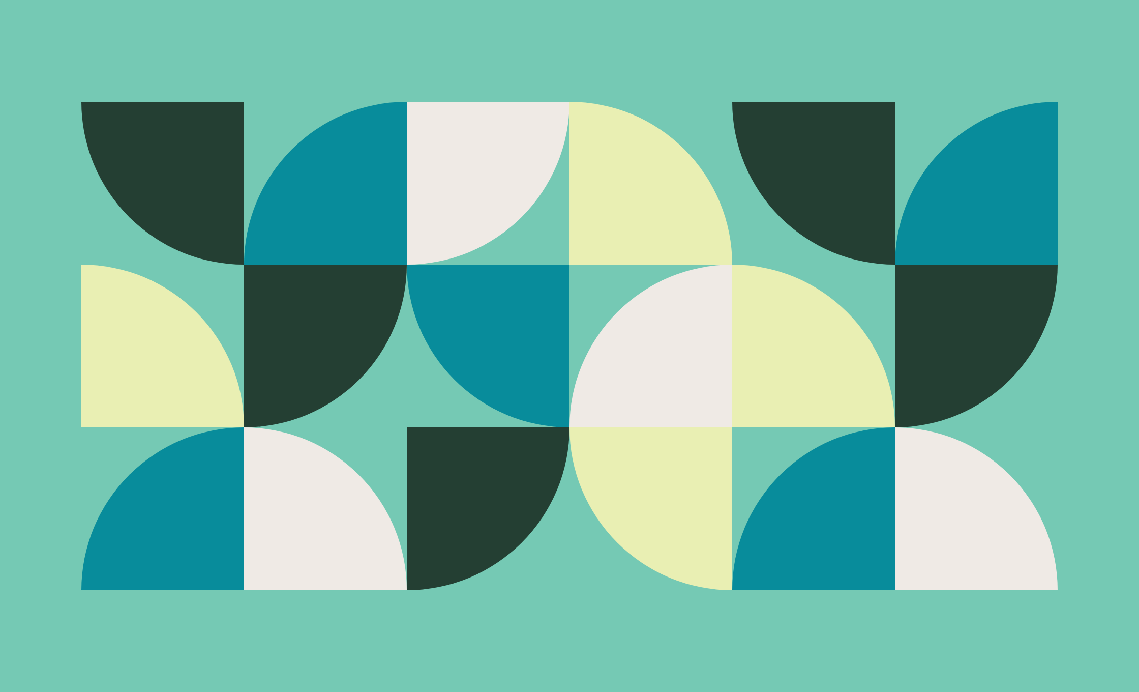
Quarter circles that line up. On hover, the tiles snap into order.
LB Pharmaceuticals · LB-102-011
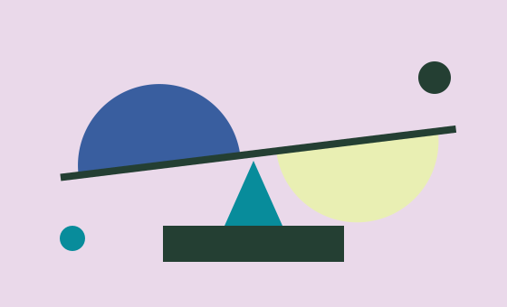
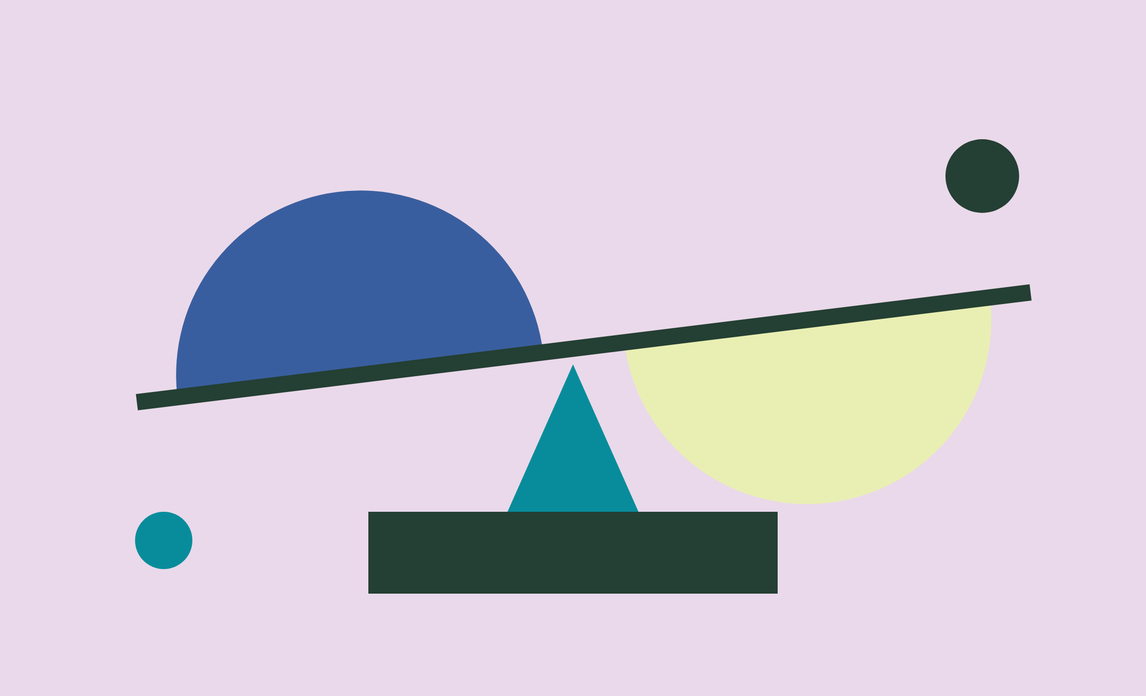
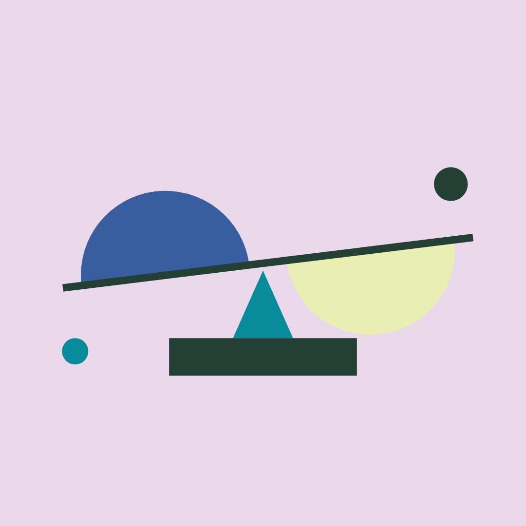
Two halves on one beam. On hover, the beam levels.
Compass Redefine · COMP 202
Same Deep Sea ground as the other PTSD study, its own figure color and a new motif.
Figurative · quiet figures, held light
Figurative scenes show feelings and settings without showing a real participant: closed-eye calm, one circle of light, Utah underfoot.
Solid fills only. No outlines, gradients, texture, grain or shadows. Depth comes from overlap and one darker step of the same color.
Every scene holds one halo: two concentric chartreuse rings as sun, moon, lamp or window. Off to one side, never behind a head.
Eyes closed or lowered, drawn as short arcs. No nose, brows or open mouth. Posture carries the feeling.
Show rest, company, care and steadiness. The copy can name the struggle; the picture holds the hope.
Utah in three to five bands: Timpanogos, the arches, aspens, the lake. Known by silhouette, not detail.
Exam and session rooms get a window, a plant, a soft chair. Equipment pared to one or two objects.
Figurative moods
Never draw
Where each style goes
Geometric: study art on the website, recruitment ads, flyers and signage. Figurative: social posts, print and decks, where a person helps. In a figurative set, show a range of skin tones, ages and body types. All recruitment art is IRB-reviewed like any other ad.
06 · Voice
Clear over clever. Precise over hyped. Warm over sterile. Every sentence is plain, short and does a job.
Words to avoid: cure, guaranteed, life-changing, journey, transformative, trip, unlock, empower, seamless, elevate. "Breakthrough" describes research, never a result for a specific drug.
07 · Downloads
Always start from these masters at full size. Ask for SVG or EPS sources before large-format print or handing files to a vendor.